A new dataset of 31 million rooftops finds nearly all of them absorb most of the sun that hits them — on every continent.
More than 4,500 years ago, the Pyramids of Giza didn’t have the sandy color they do today. They were sheathed in polished white Tura limestone, bright enough to be seen for far distances, reflecting the desert sun like massive mirrors. The Egyptians called the Great Pyramid Ikhet — the “Glorious Light.” It must have been a staggering sight.
In a way, they were the first cool roofs. What made them shine is what scientists now call albedo: the amount of sunlight a surface bounces back instead of soaking up. The builders were likrly not thinking about heat, and with millions of tons of stone the pyramids soaked up plenty of it anyway.
Today, most roofs do the opposite. Dark surfaces, rusted iron sheets, asphalt tiles dominate rooftops across much of the Global South, absorbing most of the sun’s energy and radiating it back down as heat. Cities like Ibadan, Nigeria, or Kumasi, Ghana are full of these brown-roofed neighborhoods, and the roofs make the whole area hotter. The health toll is real, especially for older people and infants: broken sleep, no relief from the heat, a higher chance of getting sick.
City planners have known the fix for a long time. Paint a roof white, or coat it with reflective material, and heat absorption drops sharply. Studies have measured roof surface temperatures falling 15°C to 30°C and indoor temperatures 2°C to 5°C. For someone without air conditioning, which is most people in the Global South, that’s the difference between an OK night and a brutal one.
But how do you find the worst roofs at the scale of a city, or a country? What pulled me down this rabbit hole was a paper and dataset from research colleagues and their collaborators that takes on exactly that question. For decades, scientists faced a trade-off: free public satellite imagery is too blurry to pick out the small, old, densely packed buildings in informal settlements — the very places that need cooling most — while the commercial imagery sharp enough to see them is expensive and patchy. The paper’s move is to fuse the two: the complete global coverage of the free data, the detail of the commercial data. It’s a similar super-resolution idea my team used on Open Buildings, an earlier project I was involved with that mapped building and road footprints across Africa but pointed at a new target. Instead of a building’s outline, it recovers the building’s thermal identity, turning blurry 10-meter blocks into rooftop-level albedo estimates as sharp as a drone flyover.
Now the data.
Globla state of urban rooftop solar albedo and cool roo adotoption (sampled cities) Highresolution satelite measurement across 31M rooftops in 67 urban agglomerations
London, one of the wealthiest cities on the planet, in a country that pioneered the industrial revolution, sits at a median roof reflectivity of 0.10 out of 1.0. More than 95% of its rooftops are classified as “very dark”.
According to roof tops sampled in this dataset, London has only 3 cool roofs in total: two industrial buildings, and one backyard storage unit in Eastern London ( yes that tiny white rooftop in the middle below).
The only non industrial cool roof in London according to sampled roof tops (Google Maps)
(Worth flagging: these are models estimates with margin of errors, a roof could’ve been repainted or sits under the cover of a tree, still just a few vs millions tells a story of its own)
Even within Africa, the range is wide. Surprisingly to me, northern Nigerian cities like Kano have naturally higher reflectivity. Light-colored metal roofing, plus dust that settles in arid climates happens to help them reflect more light. Possibly the one case where dust is actually useful.
Lagos is a coastal megacity with high humidity. Cooler during the rainy season but the rest of the year you feel the heat. It’s a daily physical tax on people who live in the densest, least served parts of the city, who are also least likely to have air conditioning or even constant electricity. Lagos has 6 cool roofs out of 955,543 buildings sampled. Another surprise here, two of them are mega churches in Victoria Island, one of the wealthiest districts in the city.
Two “Cool roofs” in Lagos VI (blue dots)
Kisumu, Kenya, a hot city right on Lake Victoria has 2 out of 147,252 sampled.
Across more than 4.5 million buildings scanned across African cities, over 90% of rooftops are absorbing at least three-quarters of incoming sunlight. Heat magnets, everywhere.
African Cities Cool Roof Spatial Infographic
This sounds like a low-hanging fruit for policy in Africa. Ahmedabad, India proves it. Out of the 67 cities across 14 countries in this dataset, Ahmedabad stands out because of deliberate policy: a cool-roofs program launched in 2017 has measurably shifted the city’s reflectivity compared to Mumbai and Kolkata, which have no such program and absorb vastly more heat.
Indian Cities Cool Roof Spatial Infographic
Looking at the whole dataset, every continent falls below the reflectivity threshold needed to meaningfully reduce the urban heat island effect. Nobody is doing well. But the consequences of not doing well aren’t evenly distributed and Ahmedabad shows that a city can decide to change this rather than just live with it.
Since looking into this research, I’ve caught myself looking at rooftops differently on my street, from a plane window, wherever. You start noticing which houses are probably the hottest.
Congrats to everyone who made this significant research possible. (See paper for full author credits.)
Note: Infographics were generated via AntiGravity, Google’s agentic development platform.
Merci d’avoir assisté à ma présentation “De scripts Python à l’IA mondiale” à la PyCon Togo ! Comme promis, voici la liste des ressources, articles et projets open-source que j’ai mentionnés lors de mon intervention :
Active volcanoes are some of the most dynamic features on Earth, yet monitoring them on the ground is expensive and dangerous. I’m not very familiar with professional satellite observation platforms, but I imagine they are resource-intensive and require manual checking.
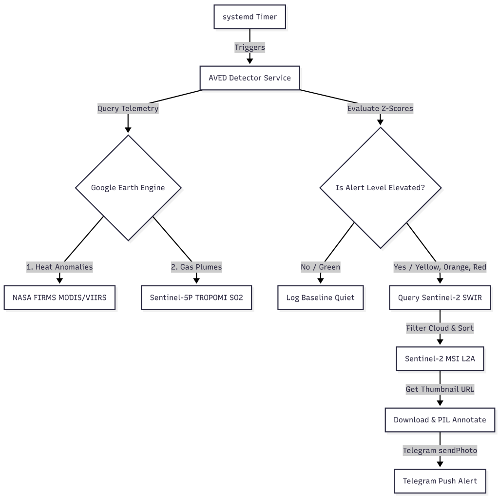
So I asked myself: could I build a cheap, agentic detection system that runs on a cloud micro-instance and give it a fancy name like AVED (Autonomous Volcanic Eruption Detector)? It is a lightweight, event-driven pipeline that integrates Google Earth Engine (GEE), Python systemd services (acting like a crontab), and Telegram to alert me within a few hours when a volcano shows signs of unrest.
Here is a look at how the system works under the hood and how it combines three distinct satellite instruments.
The Architecture: Multi-Sensor Fusion
Instead of querying heavy imagery continuously (which consumes massive processing quotas and storage), AVED operates on a two-stage, event-driven lifecycle.
Stage 1: The Near-Real-Time Trigger (FIRMS & Sentinel-5P)
The detector checks volcano coordinates periodically (via systemd timers) by querying GEE for two datasets:
NASA’s FIRMS (Thermal Hotspots): Uses MODIS and VIIRS satellite sensors. It detects thermal anomalies and updates multiple times a day with a 3 to 12-hour latency.
Copernicus Sentinel-5P (Atmospheric SO₂): Measures atmospheric Sulfur Dioxide (SO₂) columns daily with a 1 to 2-day latency.
We evaluate this telemetry using statistical Z-scores against a 30-day baseline. If the Z-score exceeds thresholds (indicating abnormal heating or gas emission), the pipeline transitions to Stage 2.
Only when an alert is flagged (Level YELLOW, ORANGE, or RED) does the agent execute the heavier imaging pipeline:
The Instrument: It queries Sentinel-2 (MSI) Level-2A surface reflectance data. Sentinel-2 has a 5-day revisit cycle.
Cloud Filtering & Sorting: It filters the last 30 days of data over the caldera, sorts them by CLOUDY_PIXEL_PERCENTAGE, and grabs the clearest image.
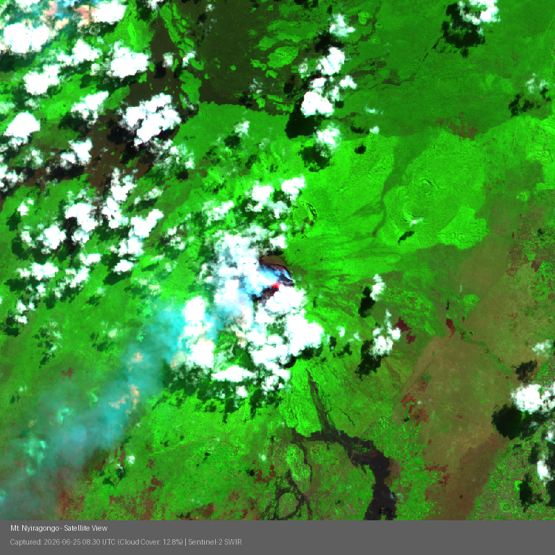
The Bands: We select bands B12 (Short-Wave Infrared 2), B8 (Near-Infrared), and B4 (Red). In this false-color configuration, vegetation shows up as vibrant green, volcanic rock as dark brown/black, and active hot spots (lava lakes or flows) glow in bright red/orange/yellow.
Auto-Annotating the Output
To make the alert actionable, the script downloads the GEE thumbnail and uses Pillow (PIL) to draw a semi-transparent dark banner at the bottom with crucial metadata:
Below is the verified output generated during the active alert for Mt. Nyiragongo in the DRC:
Can you spot active lava lake glowing in red at the crater center? You should also see the gaseous sulfur plume drifting towards the southwest.
Production Verification
I deployed the system to my Cloud instance on Google Cloud. Shortly after activation, the pipeline flagged an elevated YELLOW alert for Mt. Nyiragongo in the Democratic Republic of the Congo.
The logs show the automated execution from start to finish:
2026-06-28 20:19:38 [INFO] Fetching telemetry for Mt. Nyiragongo...
2026-06-28 20:19:39 [INFO] Elevated alert level YELLOW for Mt. Nyiragongo. Fetching satellite image...
2026-06-28 20:19:43 [INFO] HTTP Request: GET https://earthengine.googleapis.com/v1/.../thumbnails/...:getPixels "200 OK"
2026-06-28 20:19:44 [INFO] Successfully annotated and saved volcano image for Mt. Nyiragongo.
2026-06-28 20:19:46 [INFO] Telegram alert with photo sent successfully for Mt. Nyiragongo.
Why This Was Fun
By combining high-cadence thermal monitoring with high-resolution multispectral imagery on-demand, this architecture built my first smart, resource-efficient remote sensing agent.
On June 24, 2026, northern Venezuela was struck by a powerful pair of consecutive earthquakes, a major M7.2 foreshock followed closely by a massive M7.5 mainshock. When disasters of this scale hit, the immediate question for responders and researchers is always the same: Where is the population most severely impacted?
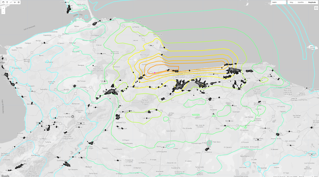
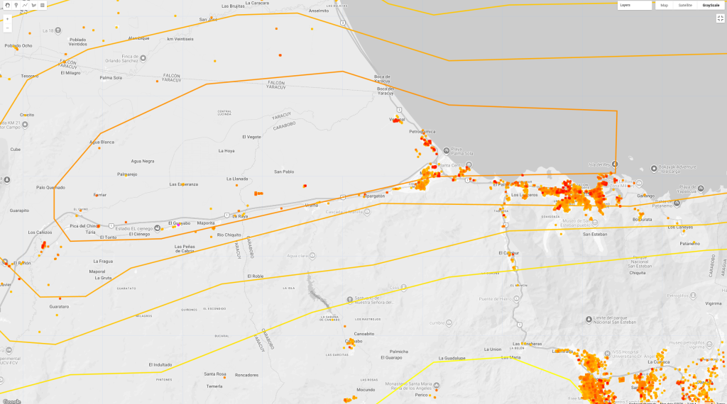
To answer this, I wanted to build a rapid visual assessment tool. In this post, I’ll walk through how I mapped the USGS ShakeMap shaking intensity contours directly over the Google Open Buildings dataset using Google Earth Engine (GEE).
As someone who was proud to work on the Google Open Buildings project, it’s still amazing to see the potential impact of the dataset now over three years old. (V1 is from 2023)
Ingesting the Seismic Data
I parsed the official USGS GeoJSON contours for both events and loaded them into GEE.
Dual-Scale Building Visualizations
I used the Google Open Buildings Temporal V1 dataset (specifically using the 2023 mosaic) and split the representation into two layers:
Regional Scale (Heatmap): A smooth settlement density heatmap generated
Local Scale (Footprints): Diliated building footprints and height rasters.
Key Takeaway: Morón and Puerto Cabello
The epicenters of both the M7.2 and M7.5 events were located right on the coast of the Carabobo state. When overlaying the building density hotspots, Morón and Puerto Cabello stand out as the two largest and most vulnerable urban centers directly within the highest shaking intensity zones. Puerto Cabello’s dense port infrastructure and residential zones align with the peak acceleration contours.
This took several years and I’m so happy it is finally out. We just released an open-source dataset of nearly 2M African speech records for speech recognition and vocalization (27 languages). As of today it already has close to 10k downloads and it is currently being used for ASR and TTS AI models training.
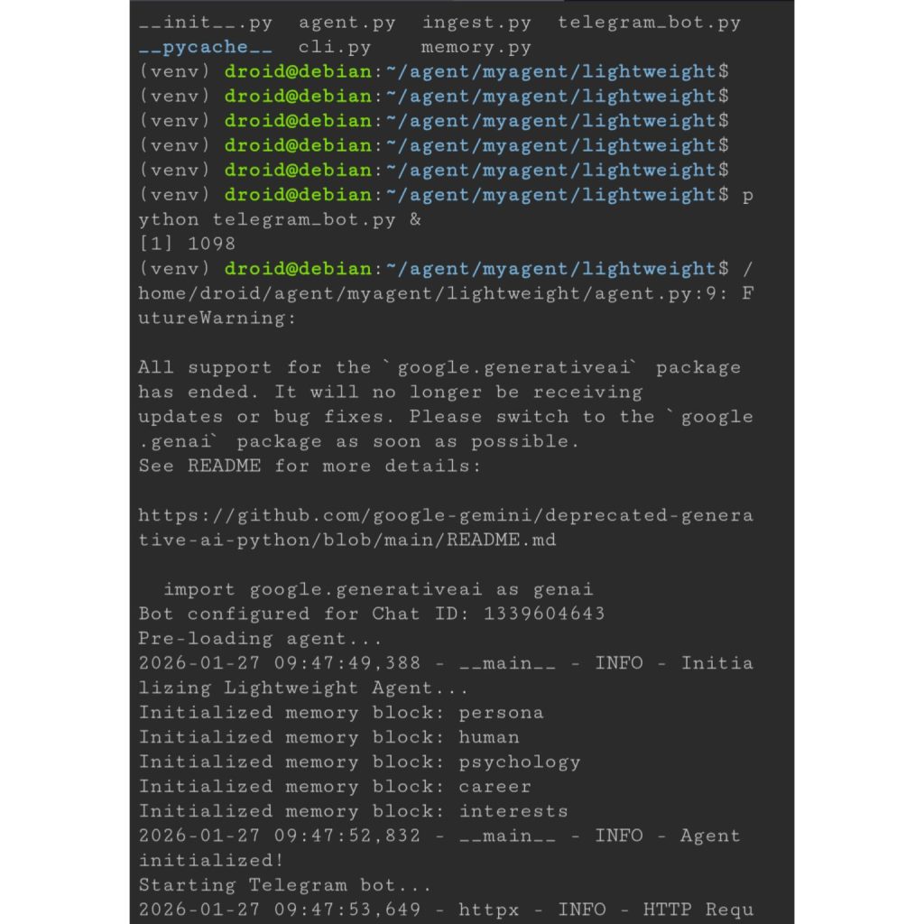
Fun experiment: I built a personalized AI agent that lives on my phone, running inside the Linux Terminal app (pixel phones only for now). I’m fascinated by AI agents and memory systems, so I integrated a lightweight database to track my digital life. It learns from my social media activity, my code, website, CV, and even my Google Scholar page. The goal is for the agent to proactively fetch tailored content (e.g., AI/ML research). It communicates via Telegram and runs on a schedule via Python’s built-in asyncio library. It leverages the Gemini API and local models for tasks like searching or quizzing me. A feature I already love: asking the agent to summarize my Bluesky feed based on my interests. Who knows, it may even reduce downscrolling! 📉.
How do you get hired in 2026? The rules have changed in the past few months.
In a world where anyone can go from idea to working app rapidly, “what you built” matters far less than “how deeply you understand it.” I just read Sakana AI’s unofficial guide on research hiring, and while it targets researchers, it’s spot on and the lessons apply to every field navigating the post-AI shift. I highly recommend it.
Here is the new hiring meta: 1. The Interview is a Debate, Not a Presentation. No one is going to be impressed with volume (e.g. code, papers). Interviewers are easily bored and they have seen the standard solutions dozens of times. Instead, turn the interview into an interesting discussion. If this doesn’t come naturally to you, treat it as a skill to practice with friends, and even an AI. Be ready to articulate why you made specific choices and defend them against alternatives. What were your “best” failures and what did you learn from them?
2. Depth > Breadth. It is easy in 2026 to be creative with AI tools. To stand out, you can’t just tweak existing paradigms. Find a “good rabbit hole.” Interviewers want to see you think deeply about small interesting things that have potential rather than throw shallow experiments at the wall.
3. AI Accelerates, You Steer. The expectation is now that you will use AI tools to be more productive. But there is a catch: You must understand every line the AI produces. Because AI creates high-level abstractions, you need to also review your basics more than ever. Do you actually remember how an Adam Optimizer works?
4. Be Your Own Harshest Critic. Before you walk in, critique your work like a skeptical reviewer. Know your limitations explicitly. If you don’t know an answer, just say so, then reason through it. Skilled interviewers can smell BS instantly, it’s a huge turn off.
The differentiator in 2026 is clarity of thought and a deep level of understanding.
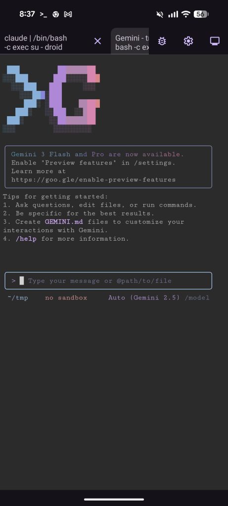
Don’t you agree this is pretty neat? 🐧 As a longtime Linux user (~20y), I got excited to see a native Debian environment land on Android 15. With regards to accessibility, a student can learn command line basics, debug while in transit, or even manage AI agents from their phone. I think having an isolated terminal in your pocket is a game changer. I tried both Google Gemini CLI and Claude Code on my device and it works quite well. No hacking or rooting required. For now, this is limited to Pixel devices, but I’m hoping we see this in more devices across the ecosystem. If you have a Pixel, here is how to unlock it: 1)Enable Developer Options. 2)Toggle on “Linux development environment.” 3) Install whatever you need (example) Open the terminal and run: sudo apt install npm npm install -g @google/gemini-cli
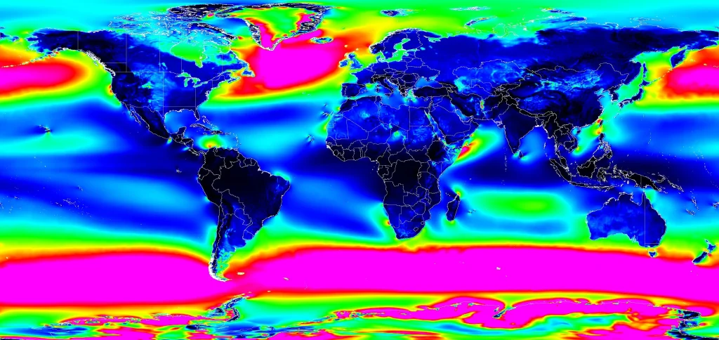
Until a few days ago, I hadn’t. I was exploring WeatherNext-2—an experimental AI weather forecasting model—when I stumbled upon something striking along the coast of East Africa. The visualization below shows global wind power potential at 100 meters (typical wind turbine height) forecasted by the model for 2025.
Global Wind Power Potential(100m) – 2025 (Experiment metric: Wind power density)
It looks like a jet engine shooting out of the Horn of Africa. A quick search confirmed this is the “Somali Jet,” a well-documented low-level atmospheric phenomenon.
But here’s what fascinated me: The AI model reproduced and forecast this jet stream without ever being explicitly programmed with the physics of fluid dynamics. It discovered this feature by learning from 40 years of historical weather data.
Going through this dataset made me feel we are going through a special moment—something noteworthy is happening in atmospheric science, and it’s worth understanding why.
The “AlphaGo” Moment for Weather forecasting
For decades, meteorology has relied on Numerical Weather Prediction (NWP). Scientists encode the fundamental laws of physics—how air pressure, temperature, humidity, and wind interact—into massive computer simulations. These models divide the atmosphere into millions of grid cells and calculate how conditions in each cell evolve over time. It’s amazing science and research, but it requires enormous computational resources. Running a global weather forecast on traditional systems is like playing chess by calculating every possible future position, it’s computationally expensive.
Learning from History
WeatherNext-2 represents a different approach, powered by a technique called FGN (Functional Generative Networks). Instead of being programmed with physics equations, the model learned atmospheric dynamics by “studying” patterns in 40 years of historical weather data.
Rather than teaching a computer the rules of chess and having it calculate moves, imagine showing it millions of chess games and letting it discover winning strategies on its own. That’s the shift happening in weather forecasting.
FGN outperforms the previous state-of-the-art ML model (GenCast) while providing an extra 24 hours of lead time for tracking tropical cyclones. That extra day can make a big difference to prepare.
Computational Efficiency: Despite being a larger model than GenCast, FGN generates a 15-day forecast in under 1 minute on a single TPU, 8 times faster than GenCast. This is because it requires only a single forward pass through the network, unlike diffusion models that need iterative refinement.
To put it simply, the model understands that the atmosphere is deeply interconnected—that the pressure in Dakar is linked to conditions in Nairobi. It learned from observing how weather patterns actually flow across our continent and around the world.
What Makes FGN Different
Traditional ML weather models predict a single “most likely” outcome. FGN generates ensembles—64 different plausible scenarios for how weather might evolve.
What is fascinating is that FGN learned to produce these realistic probability distributions while being trained only to minimize error at individual locations (what researchers call “marginal distributions”). It wasn’t explicitly taught about spatial correlations or how different weather variables relate to each other—it discovered these relationships on its own.
To put it simply, imagine a Council of Four Grandmasters that work together to map out all the possibilities of a chess game. FGN in production employs 4 expert models to provide 64 distinct potential futures (an ensemble). This allows us to see the full range of risks—all generated in under one minute on a single TPU.
The “Clever Trick” To prevent the “blurriness” common in generative AI, WeatherNext-2 employs a Graph Transformer that injects a shared noise vector to enforce physical consistency across the globe. Imagine a conductor’s baton used to lead a symphony: this architecture allows complex global patterns (joint structure) to emerge naturally, enabling the model to master the entire planet’s weather despite being trained solely on individual locations.
A side note: If I had to pick a word for 2025, it would be “ensemble”. Ensemble forecasts, ensemble of models, mixture of experts— feels like a pattern. Diverse, specialized components working together beat singular “optimal” solutions. Four weather models trained independently outperform one perfect model.
Key Innovation: FGN generates probability distributions for weather forecasts by modeling both epistemic uncertainty (what we don’t know about the model) and aleatoric uncertainty (the inherent randomness in weather) through learned variations in the neural network’s parameters.
For those who want to hear about the research and the evolution of these models, I highly recommend this video by my colleague and one of the lead authors Ferran Alet Puig , as well as the original paper.
The WeatherNext-2 dataset acts as a massive archive of forecasts, generating new 15-day predictions every 6 hours. It’s accessible through Google Earth Engine, BigQuery, and as raw data files (you need to apply to get access).
The data includes:
Surface Variables: Temperature, precipitation, wind speed and direction at 10m and 100m above ground
Atmospheric Variables: Humidity, geopotential (related to altitude and pressure), and wind vectors at 13 different pressure levels throughout the atmosphere
Ensemble Predictions: 64 different scenarios for each variable, allowing us to calculate probabilities and confidence intervals
Data info: The model is trained on 40 years of historical weather data from ECMWF (1979-2022), using ERA5 reanalysis for pre-training and more recent operational data for fine-tuning.
Important note: Visualizations in this post are AI predictions, not observations of reality. I’m someone in research exploring geospatial data, not a climate scientist. Always refer to official meteorological agencies for actionable weather information.
Experiments: Exploring What the Model Reveals
1. Wind Energy Potential: From the Somali Jet to Global Patterns
The Somali Jet discovery got me curious: Where else might significant wind energy potential exist that we haven’t fully recognized?
Since the dataset includes wind speeds at 100 meters—the typical hub height for modern wind turbines—I combined this with the Google Open Buildings dataset to create theoretical infrastructure analyses. I simulated how a single industrial wind turbine could potentially serve households within a 5-kilometer radius.
The results surprised me.
Beyond well-known locations like the UK and South Africa, the model highlighted promising potential in:
The Mauritanian coast
Central Sahara in Chad
The coast of Somalia
Barranquilla, Colombia
Traditional wind resource assessment requires deploying expensive LIDAR equipment for up to a year at each potential site. While AI models can’t replace ground-truthing, they could dramatically reduce the search space for where to invest in detailed surveys—particularly valuable for developing regions with limited resources.
Note: These are exploratory visualizations based on forecasted wind patterns, not engineering assessments. Actual wind farm development requires detailed on-site measurements, environmental impact studies, and grid integration analysis.
2. Atmospheric Rivers: Visualizing Invisible Water Highways
Atmospheric rivers are narrow corridors of concentrated water vapor in the atmosphere—essentially rivers in the sky. When they make landfall, they can deliver enormous amounts of precipitation in a short time, causing both beneficial water supply and devastating floods.
Because FGN’s forecasts include both wind vectors and moisture data, I attempted to visualize these phenomena. The results were mesmerizing—you can see moisture being transported across entire ocean basins in streams.
Understanding and predicting atmospheric rivers is critical for water resource management and flood preparedness.
3. Storm Tracking: Melissa and Typhoon Fung-Wong
To evaluate the model’s forecasting performance, I compared its predictions against actual tropical cyclone tracks from 2025.
The animations below show Storm Melissa and Typhoon Fung-Wong, with the AI’s forecast tracks (generated days in advance) plotted against the actual paths recorded by the International Best Track Archive for Climate Stewardship (IBTrACS).
Important note: While FGN shows measurable improvements over previous models—specifically that 24-hour advantage in cyclone tracking lead time—all forecasting systems become less accurate as lead time increases. Weather is chaotic, and even the best models have uncertainty limits.
I also used the dataset to visualize significant weather events from 2025.
European Heatwaves: I was actually in London during the summer heatwave, visiting from Ghana. Seeing people walking around with mini-fans was surreal—and the model had captured this moment in its forecasts.
African Heat Patterns: I was also keen to vizualize the model’s forecasts of high-temperature events (above 35°C) across Africa to see seasonal patterns and localized extreme heat events. Understanding the predictability of these conditions could help with things such as agricultural planning.
Wind and Rain Patterns: This final visualization shows the interplay of winds and rainfall that shaped weather across the globe in 2025. The blue-to-orange gradient represents wind intensity, while the neon glow highlights precipitation.
My take away from this exploration
We are entering an era where high-resolution, probabilistic forecasting will not necessarily require supercomputing resources. This changes the economic calculus for regions like East Africa—whether that means better storm preparedness or identifying untapped wind potential in the Sahel.
For centuries, we have modeled the world by understanding the rules first, then simulating them. This model does the inverse: it observes the output (the weather) and infers the dynamics, effectively “rediscovering” features like the Somali Jet without ever seeing a physics equation.
If an AI can empirically derive the laws of fluid dynamics without the theoretical equations, what does this mean for modeling other complex systems?
There are obvious limits—these models can’t explain why something works in human-interpretable terms. But could this data-driven approach complement theoretical physics in powerful ways?
It is genuinely inspiring to witness the profound shift my colleagues are driving in how we understand our planet.
A Personal Note: The Changing Nature of Technical Work
There’s another layer to this story worth sharing.
Back at PyCon Africa 2022, I gave a talk about AI-assisted coding. I knew it was coming, but I had no idea how quickly it would transform my personal workflow.
A year ago, producing the visualizations for this post—writing the Earth Engine logic & code, debugging the vector mathematics, and fine-tuning the palettes—would have taken me weeks if not more. For this post, I iterated with Gemini to generate 80% of the code.
To be clear, it wasn’t magic. I still had to intervene quite a few times e.g fixing the code or catching “hallucinations”. But what used to be a weeks-long “project” became a fun afternoon of debugging and curation.
As we look toward 2026, I believe you will see this across many fields. Software engineers have always carried a toolkit, but that toolkit just got an upgrade. From agent frameworks to AI coding assistants, the friction now lies in mastering these new instruments and the environment.
The Paradox of Easier Code Generation
Even with AI generating code much faster than I could write it manually, software engineering principles have never been more important. When you can generate hundreds of lines in an afternoon instead of weeks, the discipline to structure, test, document, and maintain that code becomes critical. The code comes faster, but the thinking can’t be rushed. You still need to know what to build, how it should be architected, why certain approaches are better than others (e.g cost, performance,etc..) and have a plan to maintain it. It feels like we’re moving from a constraint on capability to a constraint on curiosity and judgment. The bottleneck is no longer “can I build this?” but “which solution should I select?”.
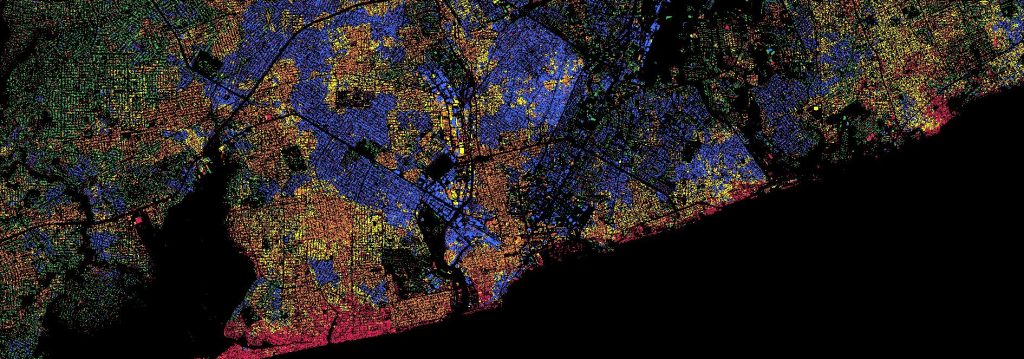
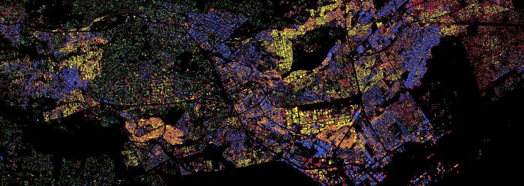
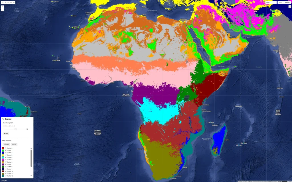
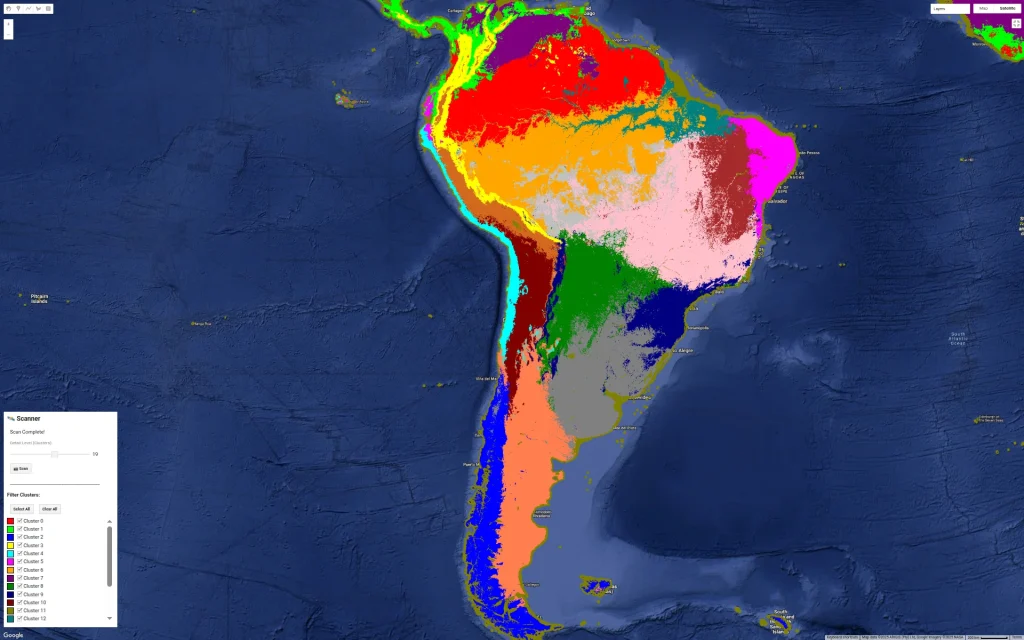
I’ve been experimenting with a fun way to visualize urban density by mixing the Google Open Buildings dataset with AlphaEarth embeddings. I’m using unsupervised clustering on top of AlphaEarth’s embeddings. Instead of coloring pixels for each area, I’ve assigned the cluster color to the building polygons themselves. The result is an interesting “fingerprint” of these cities. The clustering logic is still a bit of a mystery tobe honest, it could be picking up on building materials, street orientation, or height ect.. In some case it is just picking water bodies or green spaces. Anyway it reveals patterns that would be hard to see from a satellite image. One takeaway I have from looking at many African cities so far is the lack of green spaces which is not a secret but very visible… I am also sharing screenshots of clustering on continents and major cities but without the buildings.
// Google Open Buildings v3 view with AlphaEarth embeddings
// Experimental script - CCBY4
// --- 1. DYNAMIC GEOMETRY ---
// How to use it: Choose your current view on the map and click run
// --- 1. CAPTURE THE VIEW ---
var bounds = Map.getBounds(true);
var cityROI = ee.Geometry(bounds);

// --- 2. DATA LOADING (LOCKED TO 2023) ---
var alphaEarth = ee.ImageCollection("GOOGLE/SATELLITE_EMBEDDING/V1/ANNUAL")
    .filterBounds(cityROI)
    .filter(ee.Filter.date('2023-01-01', '2023-12-31'))
    .first()
    .clip(cityROI);

var buildings25D = ee.ImageCollection('GOOGLE/Research/open-buildings-temporal/v1')
    .filterBounds(cityROI)
    .filter(ee.Filter.eq('inference_time_epoch_s', 1688108400))
    .mosaic()
    .clip(cityROI);

var buildingPresence = buildings25D.select('building_presence');

// --- 3. SURGICAL TRAINING (BUILDINGS ONLY) ---
// We mask AlphaEarth BEFORE sampling so the trainer ONLY sees building signatures.
var buildingMask = buildingPresence.gt(0.2);
var alphaOnlyBuildings = alphaEarth.updateMask(buildingMask);

var training = alphaOnlyBuildings.sample({
  region: cityROI,
  scale: 10, // Native resolution for high precision
  numPixels: 5000,
  tileScale: 16,
  dropNulls: true // CRITICAL: This ignores non-building pixels
});

// Train Clusterer on the BUILDING signatures only
var clusterer = ee.Clusterer.wekaKMeans(6).train(training);

// Apply that "Building-Logic" to the whole city
var allClusters = alphaEarth.cluster(clusterer);

// Final visualization mask
var finalClusters = allClusters.updateMask(buildingMask);

// --- 4. VISUALIZATION ---
var clusterPalette = ['#e6194b', '#3cb44b', '#ffe119', '#4363d8', '#f58231', '#911eb4'];
var blackBackground = ee.Image(0).visualize({palette: ['#000000']});

Map.addLayer(blackBackground, {}, '1. Black Background');
Map.addLayer(finalClusters, {min: 0, max: 5, palette: clusterPalette}, '2. Surgical Building Clusters');

// --- 5. EXPORT ---
Export.image.toDrive({
  image: finalClusters.visualize({min: 0, max: 5, palette: clusterPalette}),
  description: 'ROI_2023_Building_Clusters',
  scale: 10,
  region: cityROI,
  fileFormat: 'GeoTIFF',
  maxPixels: 1e13
});