How do you get hired in 2026? The rules have changed in the past few months.
In a world where anyone can go from idea to working app rapidly, “what you built” matters far less than “how deeply you understand it.” I just read Sakana AI’s unofficial guide on research hiring, and while it targets researchers, it’s spot on and the lessons apply to every field navigating the post-AI shift. I highly recommend it.
Here is the new hiring meta:
1. The Interview is a Debate, Not a Presentation. No one is going to be impressed with volume (e.g. code, papers). Interviewers are easily bored and they have seen the standard solutions dozens of times. Instead, turn the interview into an interesting discussion. If this doesn’t come naturally to you, treat it as a skill to practice with friends, and even an AI. Be ready to articulate why you made specific choices and defend them against alternatives. What were your “best” failures and what did you learn from them?
2. Depth > Breadth. It is easy in 2026 to be creative with AI tools. To stand out, you can’t just tweak existing paradigms. Find a “good rabbit hole.” Interviewers want to see you think deeply about small interesting things that have potential rather than throw shallow experiments at the wall.
3. AI Accelerates, You Steer. The expectation is now that you will use AI tools to be more productive. But there is a catch: You must understand every line the AI produces. Because AI creates high-level abstractions, you need to also review your basics more than ever. Do you actually remember how an Adam Optimizer works?
4. Be Your Own Harshest Critic. Before you walk in, critique your work like a skeptical reviewer. Know your limitations explicitly. If you don’t know an answer, just say so, then reason through it. Skilled interviewers can smell BS instantly, it’s a huge turn off.
The differentiator in 2026 is clarity of thought and a deep level of understanding.
Category: Research
-
Depth > Breadth
-
Exploring WeatherNext-2 Earth Engine Data Catalog
Have you ever heard of the Somali Jet?
(Wait for it)
Until a few days ago, I hadn’t. I was exploring WeatherNext-2—an experimental AI weather forecasting model—when I stumbled upon something striking along the coast of East Africa. The visualization below shows global wind power potential at 100 meters (typical wind turbine height) forecasted by the model for 2025.
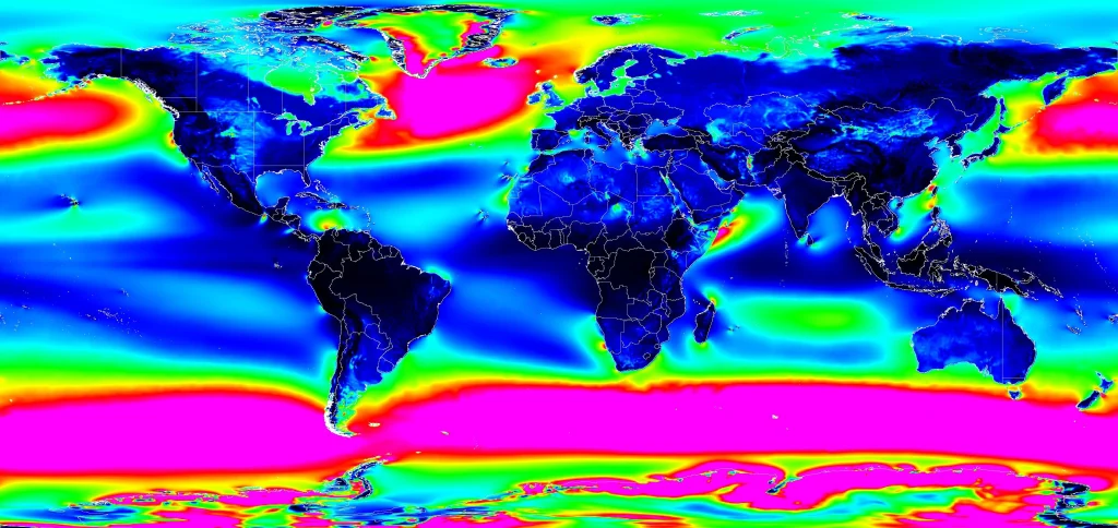
Global Wind Power Potential(100m) – 2025 (Experiment metric: Wind power density) It looks like a jet engine shooting out of the Horn of Africa. A quick search confirmed this is the “Somali Jet,” a well-documented low-level atmospheric phenomenon.
But here’s what fascinated me: The AI model reproduced and forecast this jet stream without ever being explicitly programmed with the physics of fluid dynamics. It discovered this feature by learning from 40 years of historical weather data.
Going through this dataset made me feel we are going through a special moment—something noteworthy is happening in atmospheric science, and it’s worth understanding why.
The “AlphaGo” Moment for Weather forecasting
For decades, meteorology has relied on Numerical Weather Prediction (NWP). Scientists encode the fundamental laws of physics—how air pressure, temperature, humidity, and wind interact—into massive computer simulations. These models divide the atmosphere into millions of grid cells and calculate how conditions in each cell evolve over time. It’s amazing science and research, but it requires enormous computational resources. Running a global weather forecast on traditional systems is like playing chess by calculating every possible future position, it’s computationally expensive.
Learning from History
WeatherNext-2 represents a different approach, powered by a technique called FGN (Functional Generative Networks). Instead of being programmed with physics equations, the model learned atmospheric dynamics by “studying” patterns in 40 years of historical weather data.
Rather than teaching a computer the rules of chess and having it calculate moves, imagine showing it millions of chess games and letting it discover winning strategies on its own. That’s the shift happening in weather forecasting.
FGN outperforms the previous state-of-the-art ML model (GenCast) while providing an extra 24 hours of lead time for tracking tropical cyclones. That extra day can make a big difference to prepare.
Computational Efficiency: Despite being a larger model than GenCast, FGN generates a 15-day forecast in under 1 minute on a single TPU, 8 times faster than GenCast. This is because it requires only a single forward pass through the network, unlike diffusion models that need iterative refinement.
To put it simply, the model understands that the atmosphere is deeply interconnected—that the pressure in Dakar is linked to conditions in Nairobi. It learned from observing how weather patterns actually flow across our continent and around the world.
What Makes FGN Different
Traditional ML weather models predict a single “most likely” outcome. FGN generates ensembles—64 different plausible scenarios for how weather might evolve.
What is fascinating is that FGN learned to produce these realistic probability distributions while being trained only to minimize error at individual locations (what researchers call “marginal distributions”). It wasn’t explicitly taught about spatial correlations or how different weather variables relate to each other—it discovered these relationships on its own.
To put it simply, imagine a Council of Four Grandmasters that work together to map out all the possibilities of a chess game. FGN in production employs 4 expert models to provide 64 distinct potential futures (an ensemble). This allows us to see the full range of risks—all generated in under one minute on a single TPU.
The “Clever Trick” To prevent the “blurriness” common in generative AI, WeatherNext-2 employs a Graph Transformer that injects a shared noise vector to enforce physical consistency across the globe. Imagine a conductor’s baton used to lead a symphony: this architecture allows complex global patterns (joint structure) to emerge naturally, enabling the model to master the entire planet’s weather despite being trained solely on individual locations.
A side note: If I had to pick a word for 2025, it would be “ensemble”. Ensemble forecasts, ensemble of models, mixture of experts— feels like a pattern. Diverse, specialized components working together beat singular “optimal” solutions. Four weather models trained independently outperform one perfect model.
Key Innovation: FGN generates probability distributions for weather forecasts by modeling both epistemic uncertainty (what we don’t know about the model) and aleatoric uncertainty (the inherent randomness in weather) through learned variations in the neural network’s parameters.
For those who want to hear about the research and the evolution of these models, I highly recommend this video by my colleague and one of the lead authors Ferran Alet Puig , as well as the original paper.
Graph Neural Networks for Skillful Weather Forecasting
Paper: Skillful joint probabilistic weather forecasting from marginals
What’s in the Dataset?
What’s Available
The WeatherNext-2 dataset acts as a massive archive of forecasts, generating new 15-day predictions every 6 hours. It’s accessible through Google Earth Engine, BigQuery, and as raw data files (you need to apply to get access).
The data includes:
- Surface Variables: Temperature, precipitation, wind speed and direction at 10m and 100m above ground
- Atmospheric Variables: Humidity, geopotential (related to altitude and pressure), and wind vectors at 13 different pressure levels throughout the atmosphere
- Ensemble Predictions: 64 different scenarios for each variable, allowing us to calculate probabilities and confidence intervals
Data info: The model is trained on 40 years of historical weather data from ECMWF (1979-2022), using ERA5 reanalysis for pre-training and more recent operational data for fine-tuning.
Important note: Visualizations in this post are AI predictions, not observations of reality. I’m someone in research exploring geospatial data, not a climate scientist. Always refer to official meteorological agencies for actionable weather information.
Experiments: Exploring What the Model Reveals
1. Wind Energy Potential: From the Somali Jet to Global Patterns
The Somali Jet discovery got me curious: Where else might significant wind energy potential exist that we haven’t fully recognized?
Since the dataset includes wind speeds at 100 meters—the typical hub height for modern wind turbines—I combined this with the Google Open Buildings dataset to create theoretical infrastructure analyses. I simulated how a single industrial wind turbine could potentially serve households within a 5-kilometer radius.
The results surprised me.
Beyond well-known locations like the UK and South Africa, the model highlighted promising potential in:
- The Mauritanian coast
- Central Sahara in Chad
- The coast of Somalia
- Barranquilla, Colombia
Traditional wind resource assessment requires deploying expensive LIDAR equipment for up to a year at each potential site. While AI models can’t replace ground-truthing, they could dramatically reduce the search space for where to invest in detailed surveys—particularly valuable for developing regions with limited resources.
Note: These are exploratory visualizations based on forecasted wind patterns, not engineering assessments. Actual wind farm development requires detailed on-site measurements, environmental impact studies, and grid integration analysis.
2. Atmospheric Rivers: Visualizing Invisible Water Highways
Atmospheric rivers are narrow corridors of concentrated water vapor in the atmosphere—essentially rivers in the sky. When they make landfall, they can deliver enormous amounts of precipitation in a short time, causing both beneficial water supply and devastating floods.
Because FGN’s forecasts include both wind vectors and moisture data, I attempted to visualize these phenomena. The results were mesmerizing—you can see moisture being transported across entire ocean basins in streams.
Understanding and predicting atmospheric rivers is critical for water resource management and flood preparedness.
3. Storm Tracking: Melissa and Typhoon Fung-Wong
To evaluate the model’s forecasting performance, I compared its predictions against actual tropical cyclone tracks from 2025.
The animations below show Storm Melissa and Typhoon Fung-Wong, with the AI’s forecast tracks (generated days in advance) plotted against the actual paths recorded by the International Best Track Archive for Climate Stewardship (IBTrACS).
Important note: While FGN shows measurable improvements over previous models—specifically that 24-hour advantage in cyclone tracking lead time—all forecasting systems become less accurate as lead time increases. Weather is chaotic, and even the best models have uncertainty limits.
Source of truth:
- Storm Melissa: IBTrACS track (2025291N11319)
- Typhoon Fung-Wong: IBTrACS track(2025308N10143)
4. Capturing Recent Weather Events
I also used the dataset to visualize significant weather events from 2025.
European Heatwaves: I was actually in London during the summer heatwave, visiting from Ghana. Seeing people walking around with mini-fans was surreal—and the model had captured this moment in its forecasts.
African Heat Patterns: I was also keen to vizualize the model’s forecasts of high-temperature events (above 35°C) across Africa to see seasonal patterns and localized extreme heat events. Understanding the predictability of these conditions could help with things such as agricultural planning.
Wind and Rain Patterns: This final visualization shows the interplay of winds and rainfall that shaped weather across the globe in 2025. The blue-to-orange gradient represents wind intensity, while the neon glow highlights precipitation.
My take away from this exploration
We are entering an era where high-resolution, probabilistic forecasting will not necessarily require supercomputing resources. This changes the economic calculus for regions like East Africa—whether that means better storm preparedness or identifying untapped wind potential in the Sahel.
For centuries, we have modeled the world by understanding the rules first, then simulating them. This model does the inverse: it observes the output (the weather) and infers the dynamics, effectively “rediscovering” features like the Somali Jet without ever seeing a physics equation.
If an AI can empirically derive the laws of fluid dynamics without the theoretical equations, what does this mean for modeling other complex systems?
There are obvious limits—these models can’t explain why something works in human-interpretable terms. But could this data-driven approach complement theoretical physics in powerful ways?
It is genuinely inspiring to witness the profound shift my colleagues are driving in how we understand our planet.
A Personal Note: The Changing Nature of Technical Work
There’s another layer to this story worth sharing.
Back at PyCon Africa 2022, I gave a talk about AI-assisted coding. I knew it was coming, but I had no idea how quickly it would transform my personal workflow.
A year ago, producing the visualizations for this post—writing the Earth Engine logic & code, debugging the vector mathematics, and fine-tuning the palettes—would have taken me weeks if not more. For this post, I iterated with Gemini to generate 80% of the code.
To be clear, it wasn’t magic. I still had to intervene quite a few times e.g fixing the code or catching “hallucinations”. But what used to be a weeks-long “project” became a fun afternoon of debugging and curation.
As we look toward 2026, I believe you will see this across many fields. Software engineers have always carried a toolkit, but that toolkit just got an upgrade. From agent frameworks to AI coding assistants, the friction now lies in mastering these new instruments and the environment.
The Paradox of Easier Code Generation
Even with AI generating code much faster than I could write it manually, software engineering principles have never been more important. When you can generate hundreds of lines in an afternoon instead of weeks, the discipline to structure, test, document, and maintain that code becomes critical. The code comes faster, but the thinking can’t be rushed. You still need to know what to build, how it should be architected, why certain approaches are better than others (e.g cost, performance,etc..) and have a plan to maintain it. It feels like we’re moving from a constraint on capability to a constraint on curiosity and judgment. The bottleneck is no longer “can I build this?” but “which solution should I select?”.
Everything in this post reflects my own opinion.
Resources:
- The Paper: Skillfull joint probabilistic weather forecasting from marginals
- Request access to the experimental dataset (Earth Engine, BigQuery, Google Cloud Storage-zarr)
- WeatherNext-2 Blog
- Google Cloud Vertex AI access (Custom inference)
- Earth Engine data catalog i used
- Code i used to explore the datasets
- ECMWF Open data
- ECMWF Reanalysis v5 (ERA5)
- Other Geospatial datasets/api:
- AlphaEarth Satellite embeddings
- Flood Forecasting API
Contact for the weatherNext team for queries about the dataset. Email address is in the data resquest form.
-
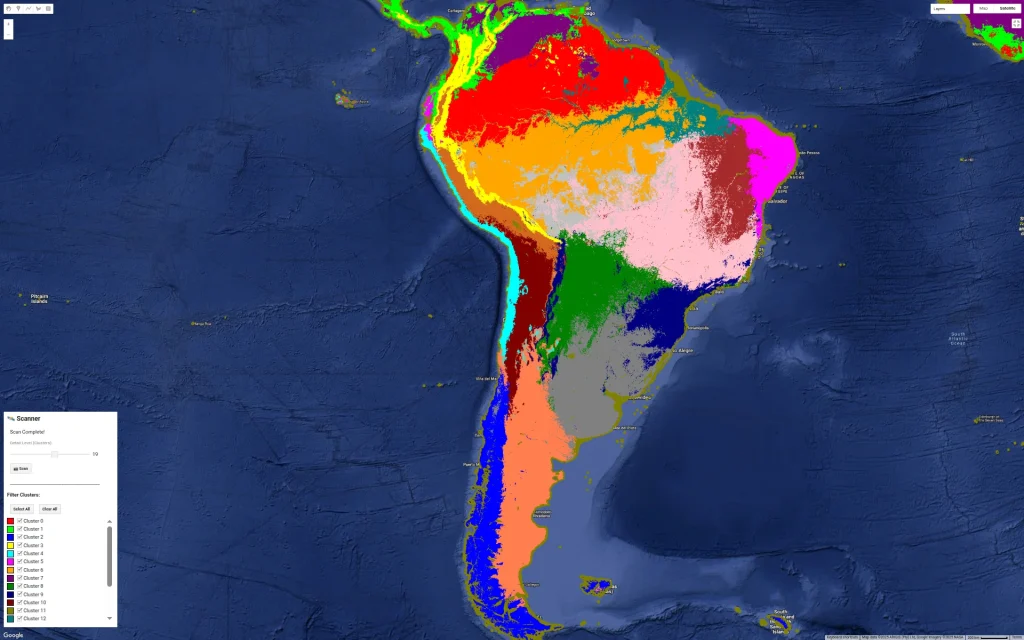
Do you recognize these cities? 🌍
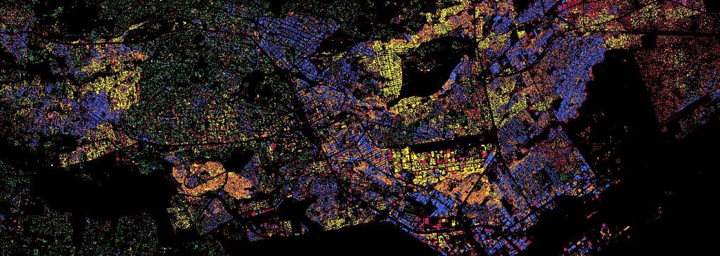
I’ve been experimenting with a fun way to visualize urban density by mixing the Google Open Buildings dataset with AlphaEarth embeddings.
I’m using unsupervised clustering on top of AlphaEarth’s embeddings. Instead of coloring pixels for each area, I’ve assigned the cluster color to the building polygons themselves.
The result is an interesting “fingerprint” of these cities. The clustering logic is still a bit of a mystery tobe honest, it could be picking up on building materials, street orientation, or height ect.. In some case it is just picking water bodies or green spaces. Anyway it reveals patterns that would be hard to see from a satellite image.
One takeaway I have from looking at many African cities so far is the lack of green spaces which is not a secret but very visible…
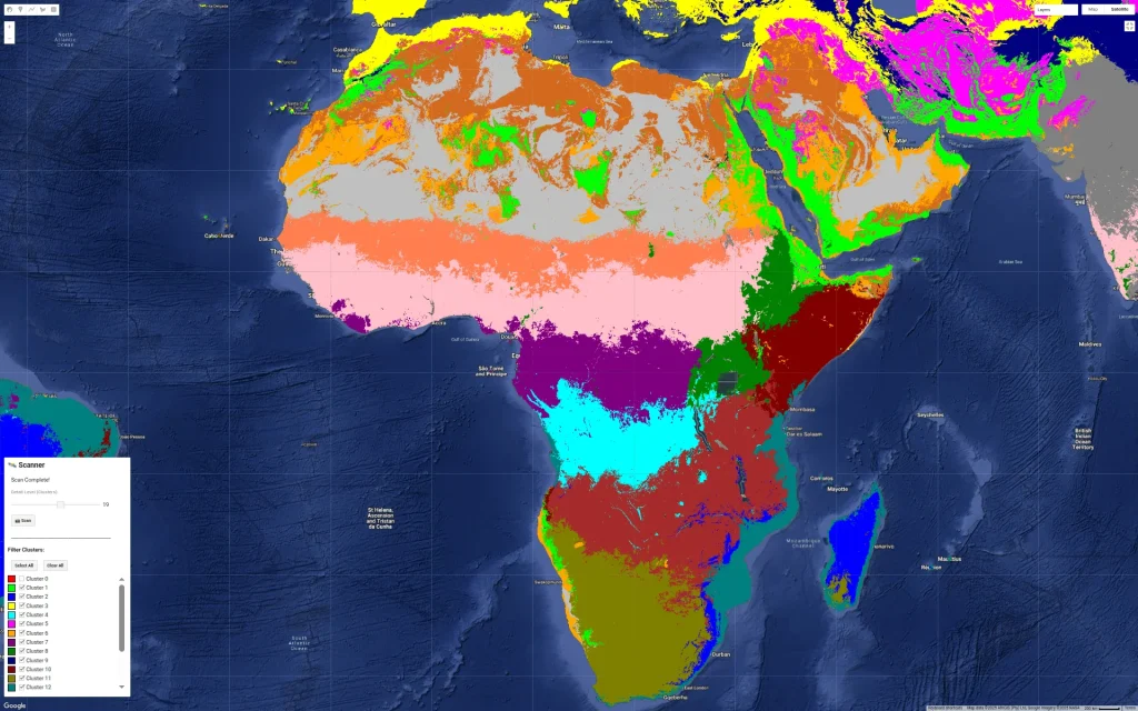
I am also sharing screenshots of clustering on continents and major cities but without the buildings.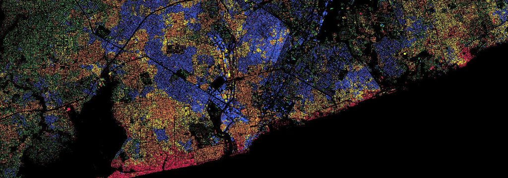


Open Buildings dataset
AlphaEarth dataset
Earth AIGoogle Earth Engine Code:
// Google Open Buildings v3 view with AlphaEarth embeddings // Experimental script - CCBY4 // --- 1. DYNAMIC GEOMETRY --- // How to use it: Choose your current view on the map and click run // --- 1. CAPTURE THE VIEW --- var bounds = Map.getBounds(true); var cityROI = ee.Geometry(bounds); // --- 2. DATA LOADING (LOCKED TO 2023) --- var alphaEarth = ee.ImageCollection("GOOGLE/SATELLITE_EMBEDDING/V1/ANNUAL") .filterBounds(cityROI) .filter(ee.Filter.date('2023-01-01', '2023-12-31')) .first() .clip(cityROI); var buildings25D = ee.ImageCollection('GOOGLE/Research/open-buildings-temporal/v1') .filterBounds(cityROI) .filter(ee.Filter.eq('inference_time_epoch_s', 1688108400)) .mosaic() .clip(cityROI); var buildingPresence = buildings25D.select('building_presence'); // --- 3. SURGICAL TRAINING (BUILDINGS ONLY) --- // We mask AlphaEarth BEFORE sampling so the trainer ONLY sees building signatures. var buildingMask = buildingPresence.gt(0.2); var alphaOnlyBuildings = alphaEarth.updateMask(buildingMask); var training = alphaOnlyBuildings.sample({ region: cityROI, scale: 10, // Native resolution for high precision numPixels: 5000, tileScale: 16, dropNulls: true // CRITICAL: This ignores non-building pixels }); // Train Clusterer on the BUILDING signatures only var clusterer = ee.Clusterer.wekaKMeans(6).train(training); // Apply that "Building-Logic" to the whole city var allClusters = alphaEarth.cluster(clusterer); // Final visualization mask var finalClusters = allClusters.updateMask(buildingMask); // --- 4. VISUALIZATION --- var clusterPalette = ['#e6194b', '#3cb44b', '#ffe119', '#4363d8', '#f58231', '#911eb4']; var blackBackground = ee.Image(0).visualize({palette: ['#000000']}); Map.addLayer(blackBackground, {}, '1. Black Background'); Map.addLayer(finalClusters, {min: 0, max: 5, palette: clusterPalette}, '2. Surgical Building Clusters'); // --- 5. EXPORT --- Export.image.toDrive({ image: finalClusters.visualize({min: 0, max: 5, palette: clusterPalette}), description: 'ROI_2023_Building_Clusters', scale: 10, region: cityROI, fileFormat: 'GeoTIFF', maxPixels: 1e13 }); -
Melissa path predictions by GDM WeatherLab
This was sobering forecast for 𝐇𝐮𝐫𝐫𝐢𝐜𝐚𝐧𝐞 𝐌𝐞𝐥𝐢𝐬𝐬𝐚 on Google DeepMind’s experimental Weather Lab. (Seen on Sunday 26th, 2025)
The AI model’s ensemble predicted with high confidence the devastating track: CAT 4 landfall in 𝐉𝐚𝐦𝐚𝐢𝐜𝐚 (around Tuesday, Oct 28th) [Turned out it was a CAT 5], followed by a CAT 3 impact on Cuba (Wednesday, Oct 29th).
References:
ECMWF Tracking: https://charts.ecmwf.int/products/cyclone/overview/product?base_time=202510260000&product=tc_strike_probability&unique_id=13L_MELISSA_2025
Google DeepMind AI Model: https://deepmind.google.com/science/go/NDyUM0uxIfrnXnAR
-
AlphaEarth Foundations: Where AI Meets Earth Observation for Unmatched Detail
🤯 This incredible image showcases the stunning beauty and diversity of the African continent, generated using the new AlphaEarth Foundations dataset on Google Earth Engine. So what is this dataset all about?
Imagine being able to X-ray the entire Earth across multiple years, even seeing through clouds! Dealing with clouds in remote sensing is a huge challenge (something I know well from my Open Buildings research project). The AlphaEarth team has essentially created a “virtual satellite” capable of doing just that. To achieve this, the AlphaEarth team combined vast amounts of data from dozens of public sources, including optical satellite images, radar, 3D laser mapping, etc.. weaving it all into a seamless picture.
Even after just a few minutes of exploring the dataset, I’ve stumbled upon fascinating insights. For example, why have Central Mali or Lake Kalala in Zambia changed so much? There’s likely a clear explanation, though I don’t know it yet.
This open dataset release is a huge step forward, likely to help scientists and experts make more informed decisions on critical global issues like food security, deforestation, urban expansion, and water resources.
If you think you can leverage this dataset for your research on our changing world, consider applying for the Satellite Embedding Grant. (Link below)
Paper: https://storage.googleapis.com/deepmind-media/DeepMind.com/Blog/alphaearth-foundations-helps-map-our-planet-in-unprecedented-detail/alphaearth-foundations.pdf
Google Deepmind Blog: https://deepmind.google/discover/blog/alphaearth-foundations-helps-map-our-planet-in-unprecedented-detail/
Google Earth blog: https://medium.com/google-earth/ai-powered-pixels-introducing-googles-satellite-embedding-dataset-31744c1f4650
Demo: https://code.earthengine.google.com/?scriptPath=Examples%3ADatasets%2FGOOGLE%2FGOOGLE_SATELLITE_EMBEDDING_V1_ANNUAL
Dataset: https://developers.google.com/earth-engine/datasets/catalog/GOOGLE_SATELLITE_EMBEDDING_V1_ANNUAL
Grant application: https://docs.google.com/forms/d/e/1FAIpQLSfxnmqM2PEKdphTWXh44jsy83SRBkn0grjg6shRS-mLJTsKrQ/viewform


-
First Images from ESA Biomass Satellite
Absolutely stunning images of Gabon and Tchad from the European Space Agency’s (ESA) Biomass satellite.
The first image shows the Ivindo River in Gabon, stretching from the DRC border all the way to Makoukou in the Ogooué-Ivindo province. This region is known for its dense forests. Typically, when we look at forests from above, all we see are the treetops. However, Biomass uses a special kind of radar, called P-band radar, which has the ability to penetrate through the forest canopy to reveal the terrain below. This means it can measure all the woody material—the trunks, branches, and stems—offering a much more complete picture than ever before.

The second image features the Tibesti Mountains in northern Chad, and it looks like something straight out of space. Here, the radar demonstrates its ability to see up to five meters beneath dry sand. This opens up fascinating possibilities for mapping and studying hidden features in deserts, such as ancient riverbeds and lakes that have long been buried. Such insights are incredibly valuable for understanding Earth’s past climates and even for locating vital water sources in arid regions.

It’s an exciting time as our ability to collect information about Earth continues to advance, especially with progress in remote sensing and Artificial Intelligence (AI). The rise of geospatial AI, in particular, is opening up fascinating new avenues for understanding our planet and opening new fields of research.
If you’re a student considering a career in understanding Earth through technology, leveraging AI. In my opinion, this field presents some interesting opportunities. You can explore more about the amazing Biomass mission on the official ESA website:
Image credit: ESA


